Interactive Data Visualization
I started working with data to start telling stories in additional and alternative formats. In five weeks, our class learnt how to work with basic visualizations through programs like Piktochart, Infogr.am, Google Maps, FusionTables and Timeline.js. We also learnt to modify HTML, CSS, JavaScript and code from Javascript libraries like d3 and Highcharts. Take a look at my work below.
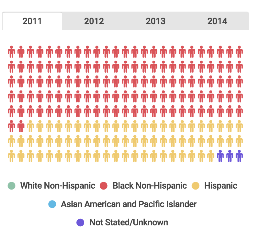
Deaths Due to HIV in New York City, 2007-2014: created with Infogr.am
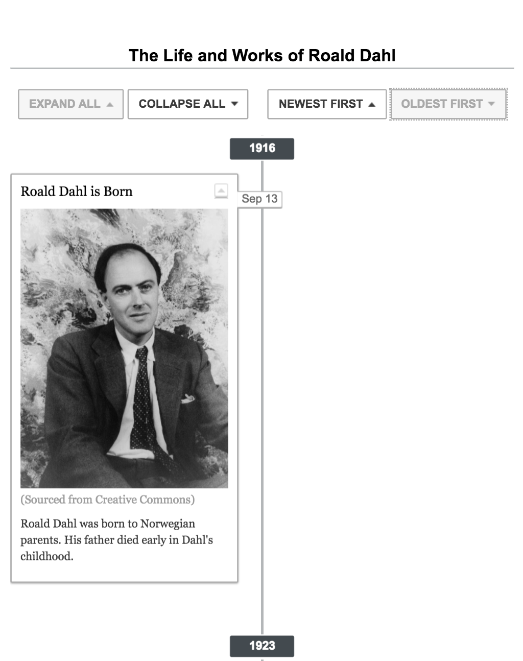
The Life and Works of Roald Dahl: created with code-based timeline and Google Sheets
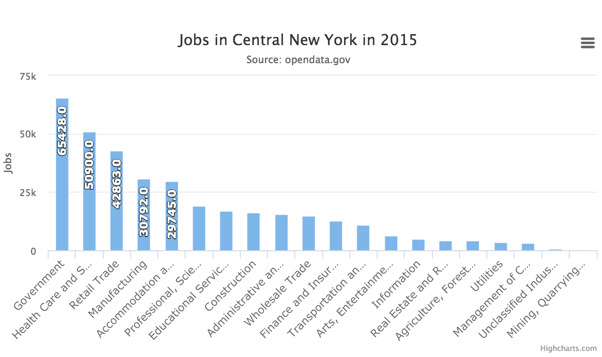
Which Industries Are Claiming the Most Jobs in Central New York? Created with Highcharts
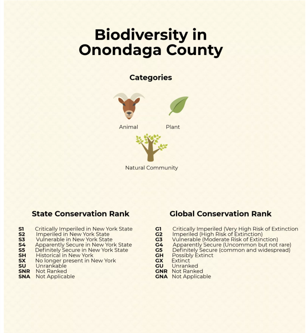
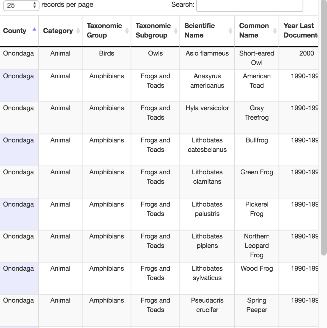
Nearly 6000 Species Contributing to Biodiversity in Central New York Are in Danger of Disappearing: created with searchable tables and Piktochart
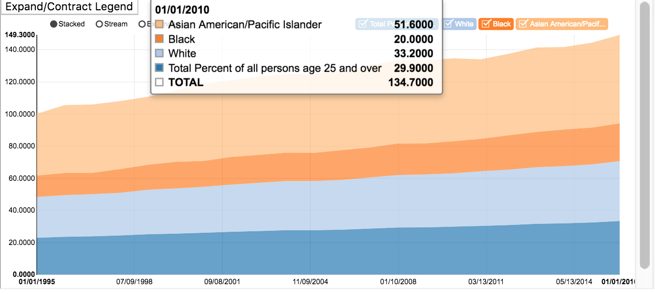
How Far Educational Attainment Has Come in the Last 20 Years, the U.S.: created with d3
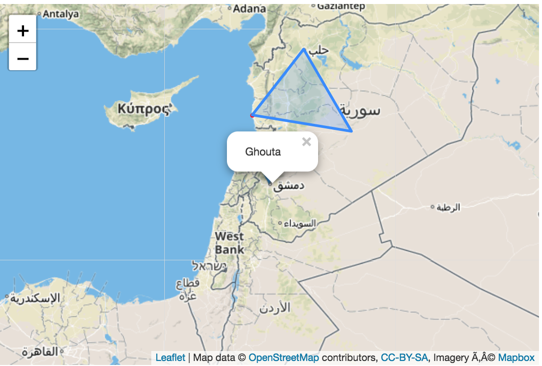
Over 500 People Have Been Killed in a Syrian Province in the Last Week: created with Leaflet.js
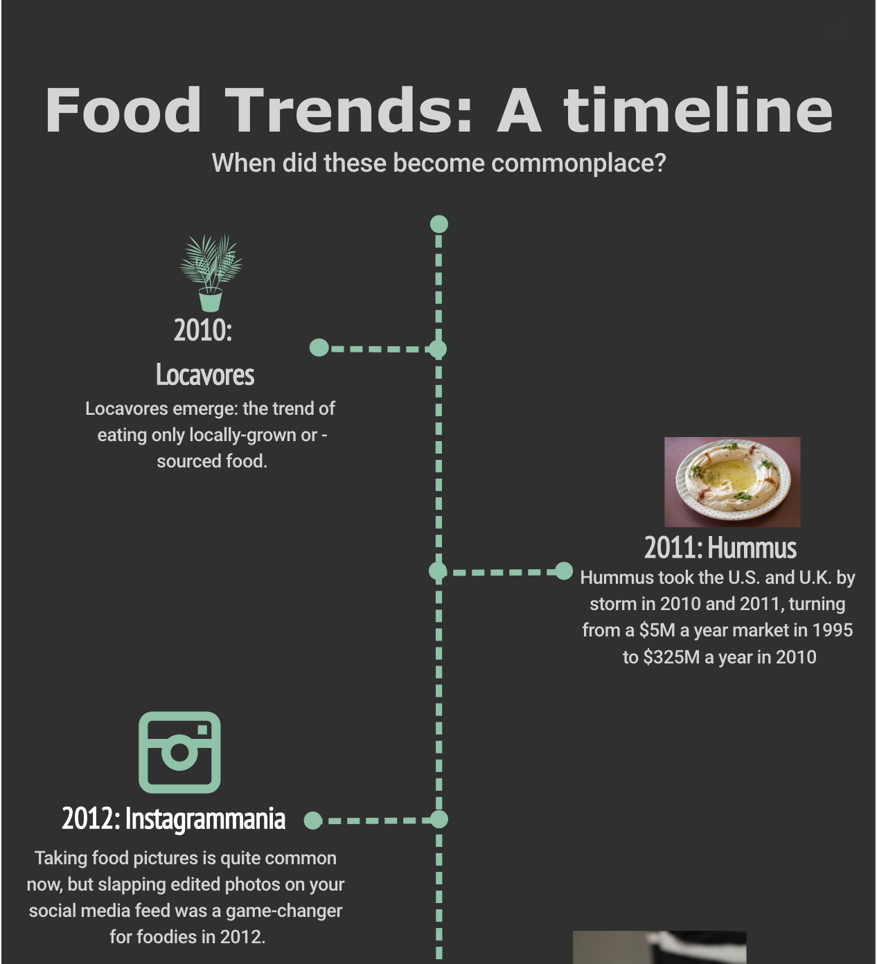
What's 2018 Bringing to Our Plates? Get Your Fill Here: Created using Highcharts, Infogr.am and Storymap.js